
A dashboard is a canvas of widgets — KPIs, charts, tables, embedded reports, maps, navigation buttons and text — arranged in a visual designer and opened from Dashboards. Its definition holds layout and source configuration, never a copy of the numbers: every time a dashboard opens, each widget's data is evaluated on the server for the person looking at it. Native widgets read an entity, a report or a Data Studio dataset; the dashboard's own visibility decides who can open it, and each source's own access rules decide what they see inside it. Building one is covered in Create a dashboard; this page explains how the library, the viewer and the access model work.
The dashboard library
- 1
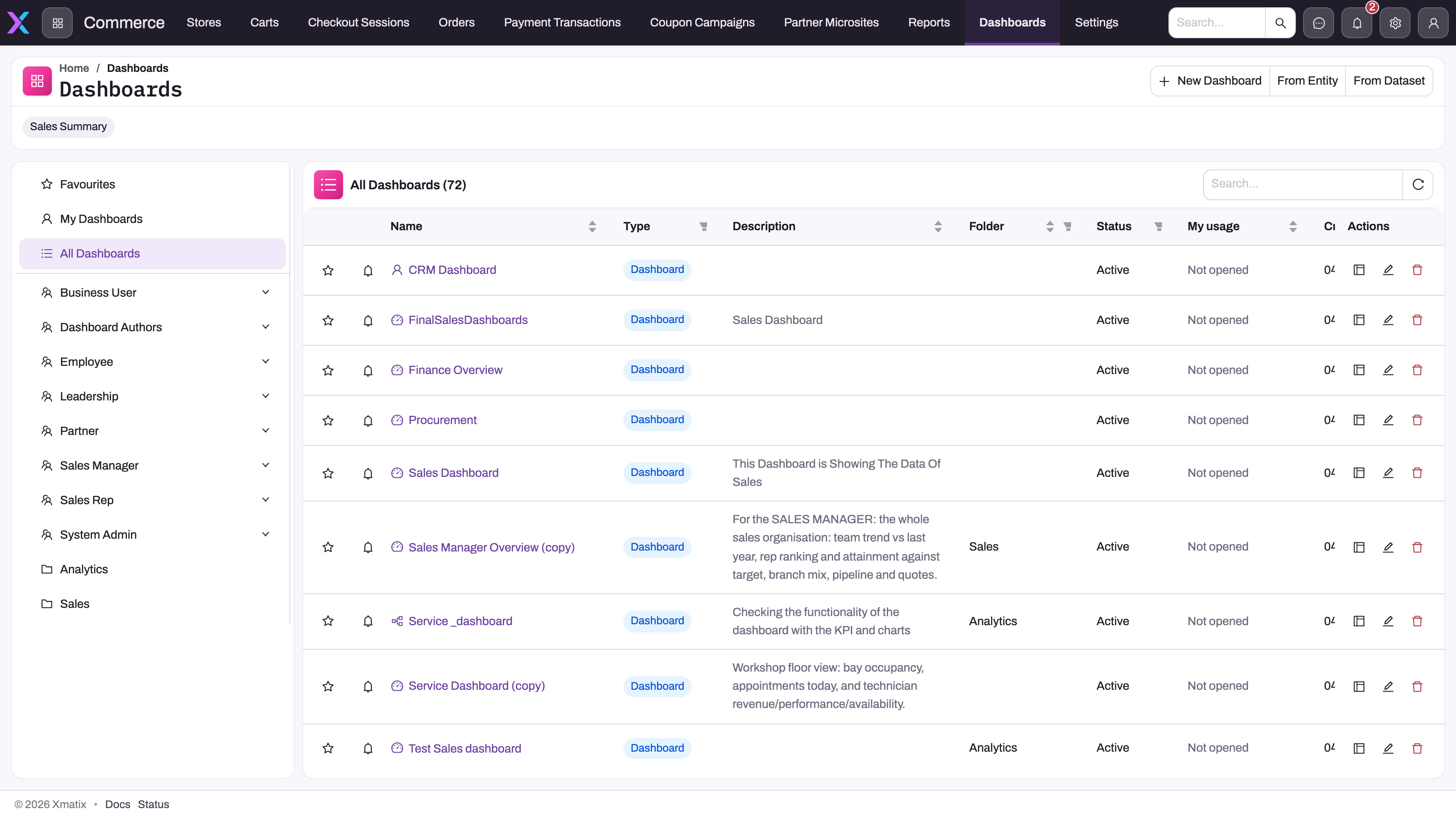
New Dashboard opens the properties dialog and then an empty canvas; From Entity and From Dataset generate a starter layout over one source.
- 2
Favourites is your own star list; My Dashboards does not yet filter by owner and shows the same rows as All Dashboards.
- 3
Folders written as Persona/Module appear as persona nodes with sub-folders; plain names (Analytics, Sales) are flat folders listed after them.
- 4
The star adds a dashboard to Favourites; the bell opens the Subscribe dialog for scheduled PDF delivery.
- 5
Type reads Dashboard for a native dashboard; Data Studio marks an older kind that opens but has no designer.
- 6
Status shows Active or Inactive and My usage how often you opened it; Actions holds Design (native only), Edit (properties and visibility) and Delete.
Dashboards in an app's navigation opens the library. The left-hand menu carries the scopes — Favourites, My Dashboards, All Dashboards — and below them the folder tree; a bar under the page header lists the dashboards you opened most recently. The page header offers three ways to start: New Dashboard (an empty canvas after a properties dialog), From Entity (a starter layout generated over one entity) and From Dataset (a starter layout over a compiled Data Studio dataset).
The table shows a star (favourite) and a bell (subscribe) toggle, then Name, Type, Description, Folder, Status (Active or Inactive), My usage (how often you have opened it and when last), Created, Created By, Modified, Modified By and the actions column. Clicking a name opens the viewer. Type reads Dashboard for a native dashboard; rows marked Data Studio are an older dashboard kind that still opens but no longer has a designer. The row actions are Design (native dashboards only — opens the designer), Edit (the properties dialog: name, label, description, folder, visibility, icon, animation, sort order, active) and Delete (permanent, after a confirmation).
Two limits of the library are worth knowing. It lists only dashboards you are allowed to see — a dashboard nobody shared with you is not there, and neither is an inactive one. And My Dashboards does not currently apply an owner filter: it shows the same rows as All Dashboards, so use the Created By column to find your own.
Folders
A folder is a name stored on the dashboard, not a managed hierarchy. The library reads it as who it is for, then what it is about: a path such as Sales Manager/CRM files the dashboard under the Sales Manager persona with a CRM sub-folder, while a plain name such as Sales is a flat folder listed after the personas. One dashboard can sit in several folders at once — the properties dialog lets you pick more than one path — without being copied. Folder placement aids discovery only; it grants no access.
The viewer
- 1
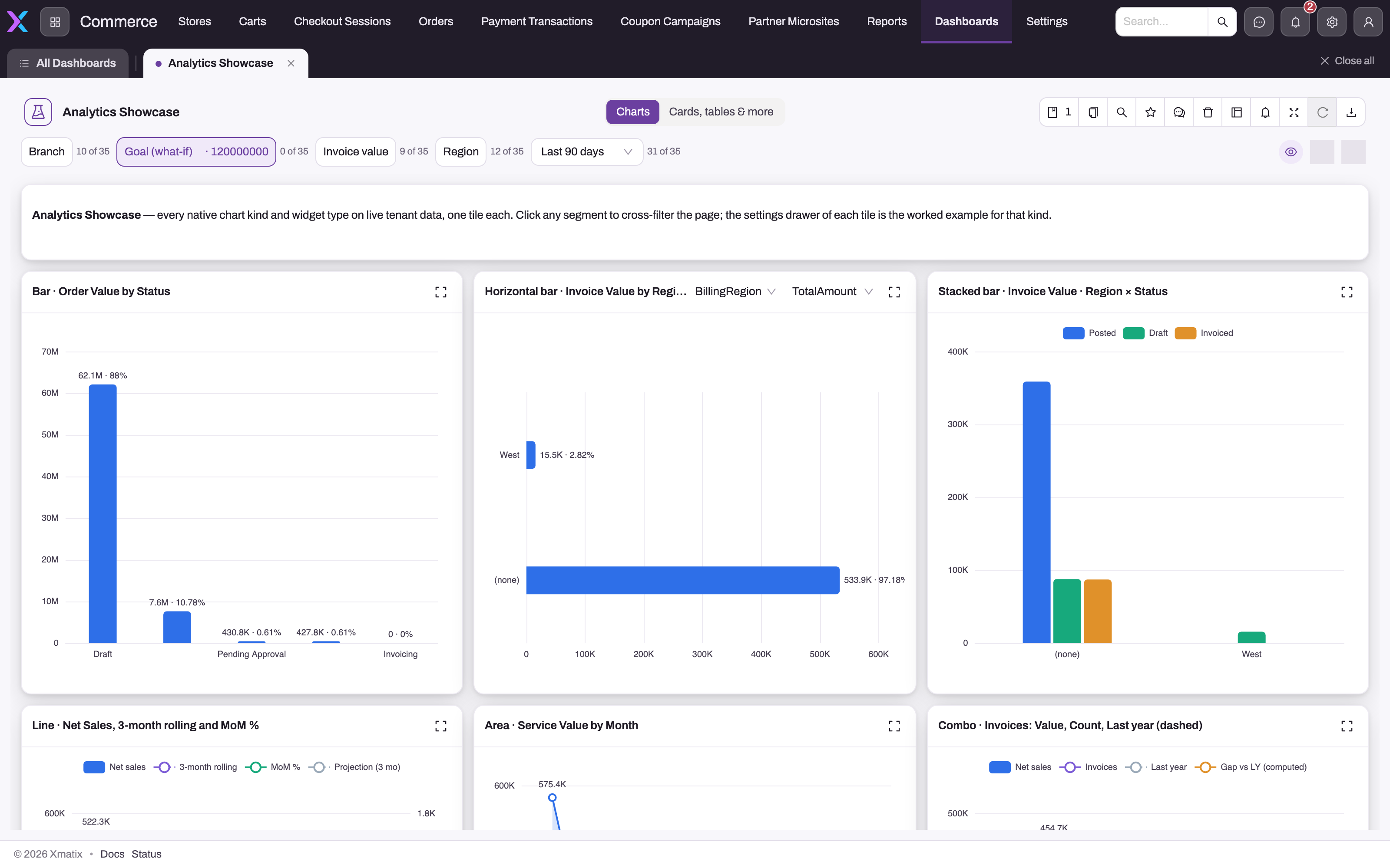
A dashboard with several pages shows a page switcher; each page is its own canvas over the shared filter bar.
- 2
Filter chips — pickers, a what-if slider, a date preset — each show how many of the page's tiles they reach (10 of 35), so you can tell which widgets a filter affects.
- 3
Views saves your page and filter state as a personal view; Clone copies the dashboard under a new name; then Find a tile, favourite star and Comments.
- 4
Delete, Design (opens the designer), the Subscribe bell (scheduled PDF), Full screen, Refresh data (available again once the one-minute cache expires) and Export as PDF or PNG.
- 5
Tiles that offer it carry their own Group by and Measure switches; the corner button focuses one tile full-size.
- 6
Click a bar or slice to cross-filter the other tiles built on the same entity instead of navigating to the record list.
Opening a dashboard adds a workspace tab beside All Dashboards and renders the canvas. Three regions matter:
- Pages. A dashboard with more than one page shows a page switcher in its header (here Charts and Cards, tables & more); each page is its own canvas over the same filters.
- The filter bar. Filters the designer configured appear as chips — a branch or region picker, a value range, a date preset such as Last 90 days with a custom-range option, and what-if parameters shown as a slider whose value feeds target and reference lines. Each chip shows how many of the page's tiles it reaches (10 of 35). Clicking a bar or slice in a chart cross-filters the other tiles built on the same entity instead of navigating away.
- The toolbar. From left to right: Views (save the current page and filter state as a named personal view, and switch between your views), Clone (copy the dashboard under a new name so you can design your own), Find a tile, the favourite star, Comments, Delete, Design (opens the designer), the subscribe bell, Full screen, Refresh data and Export (PDF, or a PNG image, matching the filters on screen). Tiles that offer it carry their own Group by and Measure switches, and every tile has a focus button that enlarges it.
Where widget data comes from
Data-bearing widgets declare a source type. A KPI reads an entity or a report; a chart reads an entity, a report or a dataset; a table and an embedded report read a report; a map reads an entity with location data. Report and dataset pickers list only definitions the designer can access, and entity-backed widgets run through the same entity, field and record security as the rest of the application. Because each widget carries its own source, one dashboard can mix an entity-backed sales chart, a dataset-backed inventory chart and an embedded receivables report without pretending they share one security path.
How a dashboard loads
When a dashboard opens, the server evaluates every widget's query under the viewing user's access and returns one batch. That batch is cached per user for a short interval — 60 seconds by default — and the viewer refetches on the same rhythm, so Refresh data is only offered again once the cached minute has passed. Two consequences follow:
- Data is near-live, not a snapshot. A number can be up to a minute old; there is no result history inside the dashboard itself (the Change history panel tracks edits to the definition, not the data).
- Access is evaluated per viewer and per source. Sharing the dashboard lets someone open it; whether a tile shows data depends on that person's access to the tile's report, dataset or entity records. A viewer who lacks report access sees an empty tile, not an error.
Sharing and delivery
A new dashboard is visible only to its creator. Edit → Visibility offers Only me, All users or Selected users, the last naming roles, profiles and teams — the same visibility rule reports follow, including the absence of an administrator bypass and the rule that an inactive dashboard is hidden from everyone. Administrators see the complete inventory in Setup → Data Studio → Analytics → Dashboards.
The bell on a row or in the viewer opens the Subscribe dialog: a dashboard is emailed as a PDF on your schedule, rendered by the background worker as you — with your filters' defaults and your access — so the attachment matches what you see on screen. A deployment can switch dashboard subscriptions off, in which case the bell simply does not appear. Designers can also add alerts to KPI tiles: a threshold checked on its own schedule, delivered in-app or by email the first time it is crossed and again when it recovers.
Common questions
Why does a colleague see empty tiles on a dashboard I shared?
Because widget data loads under the viewer's own access, sharing the dashboard is only half the job. Identify the empty tile's source and grant that: share its report, or check the viewer's access to the entity records or dataset it reads. The reasoning and the fix are in Sharing & access; if the tile is empty for you as well, open the source report directly — the problem is upstream.
Does a dashboard store data or snapshots?
No. It stores layout, widget definitions, filters and pages. Results are evaluated at open time and cached per user for about a minute, so "near-live" is the right expectation. A subscription PDF is a point-in-time rendering generated for that send; a personal View saves a page and filter state, not the numbers.
Can one dashboard show data from several entities?
Yes — that is the normal case. Each widget has its own source, so orders, inventory, receivables and visits can sit side by side as entity-, report- or dataset-backed tiles. Cross-filtering by clicking a chart applies to tiles on the same entity; filter-bar chips show how many tiles they reach so you can tell which widgets a filter will and will not affect.
What is the difference between a filter, a view and a page?
A filter is a control the designer placed in the bar; readers change its value. A view is a reader's saved combination of page and filter values, private to them and listed under Views. A page is a second canvas inside the same dashboard, sharing the filter bar. Designers define filters and pages; readers create views.